| Creating Graphical User Interfaces | |
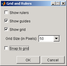
The layout area displays a grid and rulers to facilitate component layout. Grid lines are spaced at 50-pixel intervals by default and you can select from a number of other values ranging from 10 to 200 pixels. You can optionally enable snap-to-grid, which causes any object that is moved or resized to within 9 pixels of a grid line to jump to that line. Snap-to-grid works with or without a visible grid.
Use the Grid and Rulers dialog (accessed by selecting Grid and Rulers from the Tools menu) to:
| | Aligning Groups of Components -- The Alignment Tool | Aligning Components to Guide Lines | |
© 1994-2005 The MathWorks, Inc.