| Graphics | |
The plot function has different forms depending on the input arguments. For example, if y is a vector, plot(y) produces a linear graph of the elements of y versus the index of the elements of y. If you specify two vectors as arguments, plot(x,y) produces a graph of y versus x.
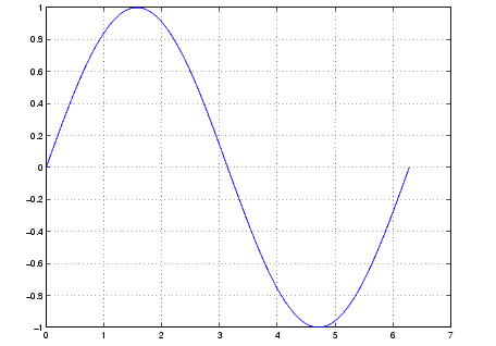
For example, the following statements create a vector of values in the range [0, 2 ] in increments of /100 and then use this vector to evaluate the sine function over that range. MATLAB plots the vector on the x-axis and the value of the sine function on the y-axis.
MATLAB automatically selects appropriate axis ranges and tick mark locations.
The graph shows a solid blue line representing the value of the sine function plotted from 0 to 2 pi. The y-axis ranges from -1 to 1 and the x-axis ranges from 0 to 7. The grid on command causes axes grid lines to be drawn with dotted black lines extended from each axis tick mark.
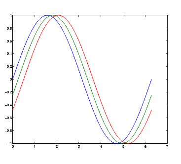
You can plot multiple graphs in one call to plot using x-y pairs. MATLAB automatically cycles through a predefined list of colors (determined by the axes ColorOrder property) to allow discrimination between sets of data. Plotting three curves as a function of t produces
The graph shows three solid lines representing the value of the sine function with a small phase shift between each line, as defined by y, y2, and y3. The lines are blue, green, and red.
| | Plotting Steps | Specifying Line Style | |
© 1994-2005 The MathWorks, Inc.