| Graphics | |
Pie Charts
Pie charts display the percentage that each element in a vector or matrix contributes to the sum of all elements. pie and pie3 create 2-D and 3-D pie charts.
Example -- Pie Chart
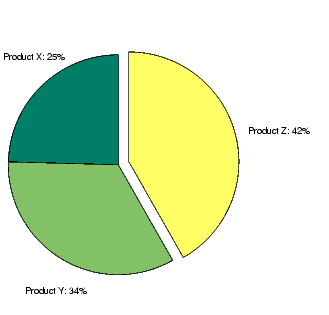
Here is an example using the pie function to visualize the contribution that three products make to total sales. Given a matrix X where each column of X contains yearly sales figures for a specific product over a five-year period,
sum each row in X to calculate total sales for each product over the five-year period.
You can offset the slice of the pie that makes the greatest contribution using the explode input argument. This argument is a vector of zero and nonzero values. Nonzero values offset the respective slice from the chart.
First, create a vector containing zeros.
Then find the slice that contributes the most and set the corresponding explode element to 1.
The explode vector contains the elements [0 0 1]. To create the exploded pie chart, use the statement
Labeling the Graph
The pie chart's labels are text graphics objects. To modify the text strings and their positions, first get the objects' strings and extents. Braces around a property name ensure that get outputs a cell array, which is important when working with multiple objects.
textObjs = findobj(h,'Type','text');
oldStr = get(textObjs,{'String'});
val = get(textObjs,{'Extent'});
oldExt = cat(1,val{:});
Create the new strings, then set the text objects' String properties to the new strings.
Names = {'Product X: ';'Product Y: ';'Product Z: '};
newStr = strcat(Names,oldStr);
set(textObjs,{'String'},newStr)
Find the difference between the widths of the new and old text strings and change the values of the Position properties.
val1 = get(textObjs, {'Extent'});
newExt = cat(1, val1{:});
offset = sign(oldExt(:,1)).*(newExt(:,3)-oldExt(:,3))/2;
pos = get(textObjs, {'Position'});
textPos =  cat(1, pos{:});
textPos(:,1) = textPos(:,1)+offset;
set(textObjs,{'Position'},num2cell(textPos,[3,2]))
| | Comparing Data Sets with Area Graphs | Removing a Piece from a Pie Chart | |
© 1994-2005 The MathWorks, Inc.