| MATLAB Function Reference | |
Create container object to exclusively manage radio buttons and toggle buttons
Syntax
Description
A uibuttongroup groups components and manages exclusive selection behavior for radio buttons and toggle buttons that it contains. It can also contain other user interface controls, axes, uipanels, and uibuttongroups. It cannot contain ActiveX controls.
uibuttongroup(' creates a visible container component in the current figure window. This component manages exclusive selection behavior for uicontrols of style PropertyName1',Value1,'PropertyName2',Value2,...)
radiobutton and togglebutton.
Use the Parent property to specify the parent as a figure, uipanel, or uibuttongroup. If you do not specify a parent, uibuttongroup adds the button group to the current figure. If no figure exists, one is created.
A uibuttongroup object can have axes, uicontrol, uipanel, and uibuttongroup objects as children. However, only uicontrols of style radiobutton and togglebutton are managed by the component.
For the children of a uibuttongroup object, the Position property is interpreted relative to the button group. If you move the button group, the children automatically move with it and maintain their positions in the button group.
Note
Include code for uicontrols of style radiobutton and togglebutton that are managed by a uibuttongroup in the SelectionChangeFcn callback function, not in the individual uicontrol Callback functions. uibuttongroup overwrites the Callback properties of radio buttons and toggle buttons that it manages. See the SelectionChangeFcn property and the example on this reference page for more information.
|
handle = uibuttongroup(...)
creates a uibuttongroup object and returns a handle to it in handle.
After creating a uibuttongroup, you can set and query its property values using set and get. Run get(handle) to see a list of properties and their current values. Run set(handle) to see a list of object properties you can set and their legal values.
Properties
This table lists all properties useful to uibuttongroup objects, grouping them by function. Each property name acts as a link to a description of the property. Curly braces denote the default value, if any.
| Property Name |
Description |
Property Value |
| Controlling Style and Appearance | ||
BackgroundColor |
Color of the uibuttongroup background |
ColorSpec. Default is the same as the default uicontrol background. |
BorderType |
Type of border around the uibuttongroup area. |
[ none | {etchedin} | etchedout | beveledin | beveledout | line ] |
BorderWidth |
Width in pixels of the button group border. |
Integer. Default is 1. |
Clipping |
Clipping of child axes, uipanels, and uibuttongroups to the uibuttongroup. Does not affect child uicontrols. |
[{on}|off] |
ForegroundColor |
Title font color and color of 2-D border line |
ColorSpec. Default is [0 0 0] (black). |
HighlightColor |
3-D frame highlight color |
ColorSpec. Default is [1 1 1] (white). |
SelectionHighlight |
Object highlighted when selected |
[{on}|off] |
ShadowColor |
3-D frame shadow color |
ColorSpec. Default is [.5 .5 .5] (grey). |
Visible |
Uibuttongroup visibility. Note: Controls the Visible property of child axes, uipanels, and uibuttongroups. Does not affect child uicontrols. |
[{on}|off] |
| General Information About the Object | ||
Children |
All children of the uibuttongroup object |
Vector of handles |
Parent |
uibuttongroup object's parent |
Scalar figure, uipanel, or uibuttongroup handle |
Selected |
Whether object is selected |
[on|{off}] |
SelectedObject |
Currently selected radio button or toggle button |
Scalar handle. Default is the first uicontrol radio button or toggle button added. Set to [] for no selection. |
Tag |
User-specified object identifier |
String |
UserData |
User-specified data |
Matrix |
| Controlling the Object Position | ||
Position |
Button group position relative to parent figure, panel, or button group |
Position spec [x y w h]. Default is [0 0 1 1] |
Units |
Units used to interpret the position vector |
[inches|centimeters |
| Controlling Fonts and Labels | ||
FontAngle |
Title font angle |
[{normal}|italic |
FontName |
Title font name |
String. Default is system dependent. |
FontSize |
Title font size |
Integer. Default is system dependent. |
FontUnits |
Title font units |
[inches|centimeters |
FontWeight |
Title font weight |
[light|{normal}|demi |
Title |
Title string |
String |
TitlePosition |
Location of title string in relation to the button group |
[{lefttop}|centertop |
| Controlling Callback Routine Execution | ||
BusyAction |
Interruption of other callback routines |
[{queue}|cancel] |
ButtonDownFcn |
Button-press callback routine |
String or function handle |
CreateFcn |
Callback routine executed during object creation |
String or function handle |
DeleteFcn |
Callback routine executed during object deletion |
String or function handle |
Interruptible |
Callback routine interruption mode |
[{on}|off] |
ResizeFcn |
User-specified resize routine |
String or function handle |
SelectionChangeFcn |
Callback routine executed when the selected radio button or toggle button changes. |
String or function handle |
UIContextMenu |
Associates a uicontextmenu with the uibuttongroup |
Scalar handle |
| Controlling Access to Objects | ||
HandleVisibility |
Handle accessibility from commandline and GUIs |
[{on}|callback|off] |
HitTest |
Selectable by mouse click |
[{on}|off] |
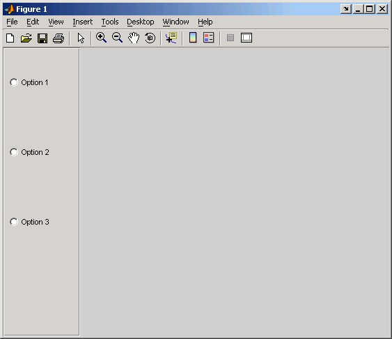
This example creates a uibuttongroup with three radiobuttons. It manages the radiobuttons with the SelectionChangeFcn callback, selcbk.
When you select a new radio button, selcbk displays the uibuttongroup handle on one line, the EventName, OldValue, and NewValue fields of the event data structure on a second line, and the value of the SelectedObject property on a third line.
h = uibuttongroup('visible','off','Position',[0 0 .2 1]);
u0 = uicontrol('Style','Radio','String','Option 1',...
    'pos',[10 350 100 30],'parent',h,'HandleVisibility','off');
u1 = uicontrol('Style','Radio','String','Option 2',...
    'pos',[10 250 100 30],'parent',h,'HandleVisibility','off');
u2 = uicontrol('Style','Radio','String','Option 3',...
    'pos',[10 150 100 30],'parent',h,'HandleVisibility','off');
set(h,'SelectionChangeFcn',@selcbk);
set(h,'SelectedObject',[]);  % No selection
set(h,'Visible','on');
For the SelectionChangeFcn callback, selcbk, the source and event data structure arguments are available only if selcbk is called using a function handle. See SelectionChangeFcn for more information.
function selcbk(source,eventdata)
disp(source);
disp([eventdata.EventName,'  ',...
     get(eventdata.OldValue,'String'),'  ', ...
     get(eventdata.NewValue,'String')]);
disp(get(get(source,'SelectedObject'),'String'));
If you click Option 2 with no option selected, the SelectionChangeFcn callback, selcbk, displays:
If you then click Option 1, the SelectionChangeFcn callback, selcbk, displays:
See Also
| | type | Uibuttongroup Properties | |
© 1994-2005 The MathWorks, Inc.