| Database Toolbox |
  |
Chart Display of Results
- After executing a query, select Chart from the Display menu.
- The Charting dialog box appears.
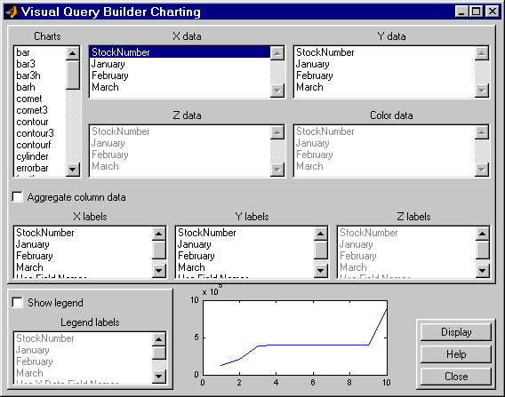
- Select the type of chart you want to display from the Charts list box (
plot is the default). For example, select pie to display a pie chart.
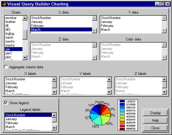
- The preview of the chart at the bottom of the dialog box shows the result of your selection. For this example, the pie chart replaces the plot line, with each stock item appearing in a different color.
- Select the data you want to display in the chart from the X data, Y data, and Z data list boxes. For the pie chart example, select
March from the X data list box to display a pie chart of March data.
- The preview of the chart at the bottom of the dialog box reflects the selection you made. For this example, the pie chart shows percentages for March data.
- To display a legend, which maps the colors to the stock numbers, select the Show legend check box.
- The Legend labels become available for you to select from.
- Select
StockNumber from the Legend labels list box.
- A legend appears in the preview of the chart. You can drag and move the legend in the preview.
.
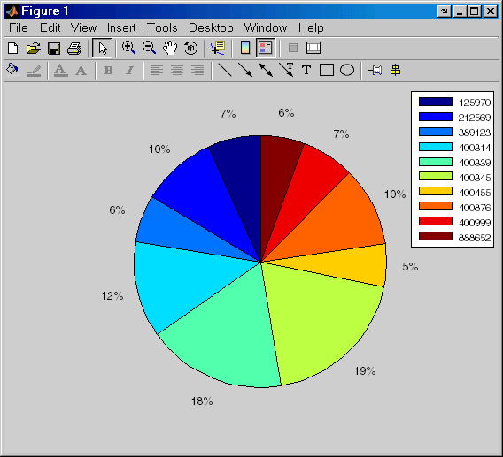
- Click Display.
- The pie chart appears in a figure window. Because the display is presented in a MATLAB figure window, you can use some MATLAB figure features such as printing or annotating the figure. To print the figure, select File -> Print. You can also use File -> Page Setup and File -> Print Preview.
For example:
- Resize the window by dragging any corner or edge.
- Drag the legend to another position.
- Annotate the chart using the Insert menu and the annotation buttons in the Plot Edit toolbar. For more information, use the figure window's Help menu.
- Click Close to close the Charting dialog box.
There are many different ways to present the query results using the chart feature. For more information, click Help in the Charting dialog box.
| | Relational Display of Data | | Report Display of Results in a Table | |
© 1994-2005 The MathWorks, Inc.