| Creating Graphical User Interfaces | |
Setting Properties for Some Specific Components
This section describes how to set properties for some specific components. The section covers the following topics:
Setting Radio Button Properties
Radio buttons have two states -- selected and not selected. You can query and set the state of a radio button through its Value property:
To make radio buttons mutually exclusive within a group, the callback for each radio button must set the Value property to 0 on all other radio buttons in the group. MATLAB sets the Value property to 1 on the radio button clicked by the user.
The following subfunction, when added to the GUI M-file, can be called by each radio button callback. The argument is an array containing the handles of all other radio buttons in the group that must be cleared.
See Radio Buttons for an example of such a function.
Setting Edit Text Box Properties
The values of the Min and Max properties for an edit text box determine whether users can enter single or multiple lines of text:
Max - Min > 1, editable text boxes accept multiline input.
Max - Min <= 1, editable text boxes accept only single-line input.
List boxes display a list of items and enable users to select one or more items. The String property contains the list of strings displayed in the list box. The first item in the list has an index of 1. Enter the list box items using the Property Inspector, one per line.
The values of the Min and Max properties for a list box determine whether users can select single or multiple lines of text:
Max - Min > 1, users can select multiple lines.
Max - Min <= 1, users can select only a single line.
The Value property contains the index into the list of strings that corresponds to the selected item. If the user selects multiple items, then Value is a vector of indices.
By default, the first item in the list is highlighted when the list box is first displayed. If you do not want any item highlighted, then set the Value property to empty, []. This works only when multiple selection is enabled.
The ListboxTop property defines which string in the list displays as the top most item when the list box is not large enough to display all list entries. ListboxTop is an index into the array of strings defined by the String property and must have a value between 1 and the number of strings. Noninteger values are fixed to the next lowest integer.
Selection Type. MATLAB sets Selection Type to normal on the first click and to open on the second click. The callback can query the Selection Type property to determine if it was a single- or double-click.
The following sections describe how to set properties for a slider.
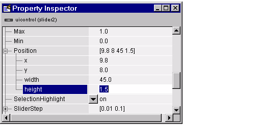
Slider Orientation. You can orient the slider either horizontally or vertically by setting the relative width and height of the Position property:
For example, these settings create a horizontal slider.
Current Value, Range, and Step Size. There are four properties that control the range and step size of the slider:
Value contains the current value of the slider.
Max defines the maximum slider value.
Min defines the minimum slider value.
SliderStep specifies the size of a slider step with respect to the range.
The Value property contains the numeric value of the slider. You can set this property to specify an initial condition and query it in the slider's callback to obtain the value set by the user. For example, your callback could contain the statement
The Max and Min properties specify the slider's range (Max - Min).
The SliderStep property controls the amount the slider Value property changes when you click the mouse on the arrow button or on the slider trough. Specify SliderStep as a two-element vector. The default, [0.01 0.10], provides a 1 percent change for clicks on an arrow and a 10 percent change for clicks in the trough. The actual step size is a function of the slider step and the slider range.
Designing a Slider. Suppose you want to create a slider with the following behavior:
Set the following slider properties using the Property Inspector. X denotes the first element of the SliderStep vector. Y denotes the second element.
SliderStep is a percentage of the slider range, which is 3. In this example, SliderStep for the arrow step size is 0.4/3 = 0.1333. SliderStep for the trough step size is 1/3 = 0.3333.
Setting Pop-Up Menu Properties
Pop-up menus open to display a list of choices when users click the arrow.
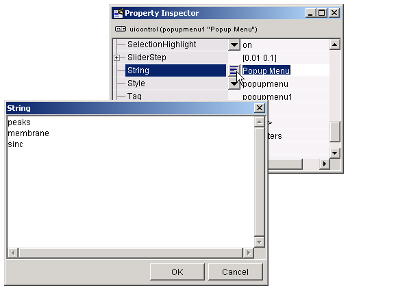
Adding Items to the Pop-Up Menu. The String property contains the list of strings displayed in the pop-up menu. Use the Property Inspector to add items to the pop-up menu by typing one per line in the String edit box:
Determining Which Item Is Selected. The Value property contains the index of the selected item. For example, if the String contains the three items, peaks, membrane, and sinc and the Value property has a value of 2, then the item selected is membrane.
When not open, a pop-up menu displays the current choice, which is determined by the index contained in the Value property. The first item in the list has an index of 1.
Pop-up menus are useful when you want to provide users with a number of mutually exclusive choices, but do not want to take up the amount of space that a series of radio buttons requires.
Enabling or Disabling Controls
You can control whether a control responds to mouse button clicks by setting the Enable property. Controls have three states:
on -- The control is operational.
off -- The control is disabled and its label (set by the string property) is grayed out.
inactive -- The control is disabled, but its label is not grayed out.
When a control is disabled, clicking on it with the left mouse button does not execute its callback routine. However, the left-click causes two other callback routines to execute:
WindowButtonDownFcn callback executes
ButtonDownFcn callback executes
A right mouse button click on a disabled control posts a context menu, if one is defined for that control. See the Enable property description for more details.
Setting Panel and Button Group Properties
Panels and button groups group related components. A panel or button group can have a title and a border. You can also specify the background and border colors.
Title. Panel and button group properties enable you to set the title, as well as its font, font size, font angle, font weight, and its position relative to the panel. Suppose you want a panel with the title "Plot Types" and you want the title:
Set the following panel properties:
Title: Plot Types
FontName: Times
FontUnits: points
FontSize: 12
FontAngle: italic
FontWeight: bold
TitlePosition: righttop
Border. Suppose, in addition, you want the panel to have a 2-point wide, white and blue, beveled-out border.
Set the following panel properties:
| | Some Commonly Used Properties | Callback Properties | |
© 1994-2005 The MathWorks, Inc.