| Graphics | |
Specifying X-Axis Data
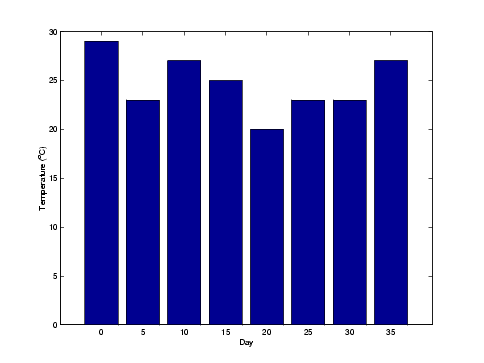
Bar graphs automatically generate x-axis values and label the x-axis tick lines. You can specify a vector of x values (or y values in the case of horizontal bar graphs) to label the axes.
For example, given temperature data,
obtained from samples taken every five days during a thirty-five day period,
you can display a bar graph showing temperature measured along the y-axis and days along the x-axis using
These statements add labels to the x- and y-axis.
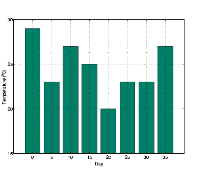
Setting Y-Axis Limits
By default, the y-axis range is from 0 to 30. To focus on the temperature range from 15 to 30, change the y-axis limits.
| | Stacked Bar Graphs to Show Contributing Amounts | Overlaying Plots on Bar Graphs | |
© 1994-2005 The MathWorks, Inc.