| Graphics | |
Overlaying Plots on Bar Graphs
You can overlay data on a bar graph by creating another axes in the same position. This enables you to have an independent y-axis for the overlaid dataset (in contrast to the hold on statement, which uses the same axes).
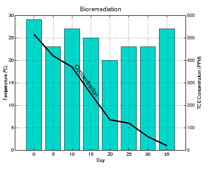
For example, consider a bioremediation experiment that breaks down hazardous waste components into nontoxic materials. The trichloroethylene (TCE) concentration and temperature data from this experiment are
This data was obtained from samples taken every five days during a thirty-five day period.
Display a bar graph and label the x- and y-axis using the statements
Overlaying a Line Plot on the Bar Graph
To overlay the concentration data on the bar graph, position a second axes at the same location as the first axes, but first save the handle of the first axes.
Create the second axes at the same location before plotting the second dataset.
To ensure that the second axes does not interfere with the first, locate the y-axis on the right side of the axes, make the background transparent, and set the second axes' x-tick marks to the empty matrix.
Align the x-axis of both axes and display the grid lines on top of the bars.
Annotating the Graph. These statements annotate the graph.
text(11,380,'Concentration','Rotation',-55,'FontSize',16)
ylabel('TCE Concentration (PPM)')
title('Bioremediation','FontSize',16)
To print the graph, set the current figure's PaperPositionMode to auto, which ensures the printed output matches the display.
| | Specifying X-Axis Data | Area Graphs | |
© 1994-2005 The MathWorks, Inc.