| 3-D Visualization | |
Stream Line Plots of Vector Data
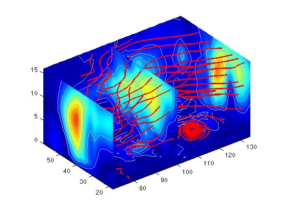
MATLAB includes a vector data set called wind that represents air currents over North America. This example uses a combination of techniques:
1. Determine the Range of the Coordinates
Load the data and determine minimum and maximum values to locate the slice planes and contour plots (load, min, max).
2. Add Slice Planes for Visual Context
Calculate the magnitude of the vector field (which represents wind speed) to generate scalar data for the slice command. Create slice planes along the x-axis at xmin, 100, and xmax, along the y-axis at ymax, and along the z-axis at zmin. Specify interpolated face coloring so the slice coloring indicates wind speed, and do not draw edges (sqrt, slice, FaceColor, EdgeColor).
wind_speed = sqrt(u.^2 + v.^2 + w.^2);
hsurfaces = slice(x,y,z,wind_speed,[xmin,100,xmax],ymax,zmin);
set(hsurfaces,'FaceColor','interp','EdgeColor','none')
3. Add Contour Lines to the Slice Planes
Draw light gray contour lines on the slice planes to help quantify the color mapping (contourslice, EdgeColor, LineWidth).
hcont = ...
contourslice(x,y,z,wind_speed,[xmin,100,xmax],ymax,zmin);
set(hcont,'EdgeColor',[.7,.7,.7],'LineWidth',.5)
4. Define the Starting Points for the Stream Lines
In this example, all stream lines start at an x-axis value of 80 and span the range 20 to 50 in the y direction and 0 to 15 in the z direction. Save the handles of the stream lines and set the line width and color (meshgrid, streamline, LineWidth, Color).
[sx,sy,sz] = meshgrid(80,20:10:50,0:5:15);
hlines = streamline(x,y,z,u,v,w,sx,sy,sz);
set(hlines,'LineWidth',2,'Color','r')
5. Define the View
Set up the view, expanding the z-axis to make it easier to read the graph (view, daspect, axis).
See coneplot for an example of the same data plotted with cones.
| | Accessing Subregions of Volume Data | Displaying Curl with Stream Ribbons | |
© 1994-2005 The MathWorks, Inc.