| Database Toolbox |
  |
X Data, Y Data, Z Data, and Color Data
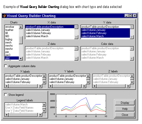
- In the VQB Charting dialog box, after selecting the type of chart, select the X data, Y data, Z data, and Color data (representing a fourth dimension) you want to chart.
- To select more than one item in a list, hold down the Ctrl key or Shift key while selecting.
- After selecting the data fields, the preview of that chart updates to reflect the selections.
- If the data you selected cannot be used to create the type of chart you selected, an error message appears in the preview area. Change your data or chart selections, or see
help for the selected chart type.
- Next, select the Aggregate Column Data check box if you want that feature.
This example shows a plot (type of chart) of sales volume over three months (Y data) by product (X data). The February plot includes a gap where the query returned NULL values as NaNs from the database.
See Also.
| | Charts | | Aggregate Column Data | |
© 1994-2005 The MathWorks, Inc.